On Science Communication, Part Two
In part two of my science communication series, I’ll talk about different options of communicating science graphically. It’s hard to overstate the importance of making visually appealing infographics and figures that break down complex subjects into digestible parts.

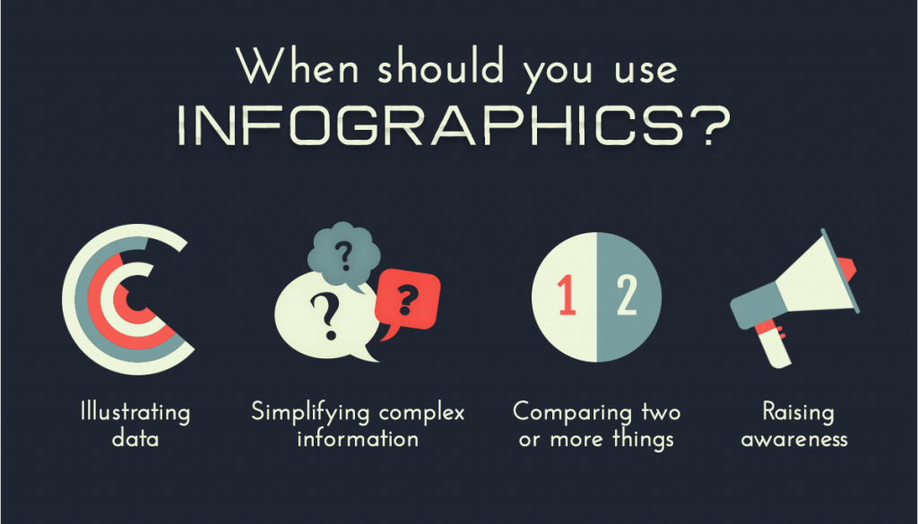
Figure 1. Infographic by creators at Snobmonkey.
How are These Graphics Made?
Most researchers use powerpoint to make figures and infographics because it allows you to group shapes and replicate them with simple copy-paste. Further, resizing these group objects is simply done by just clicking the group and dragging the corners. For a great post on using powerpoint to create visually appealing infographics, see here. Like others, I have heavily relied on powerpoint for making figures in papers, making infographics, and, of course, putting together presentations. While I’ve had pretty good success with powerpoint, I have noticed some shortcomings of powerpoint for creation of beautiful graphics including:
- Compatibility issues between different versions
- Large file sizes often hinder collaboration unless stored on large-file compatible cloud storage system
- Shapes used to make infographics are not vector-based and thus do not scale well
Nonetheless, I’ve learned to work with what I had (including my limited artistic abilities) and have assembled some pretty eye catching work over the years. See below.

Figure 2. My recent poster on my PhD research.
Alas, powerpoint is obviously a powerful and intuitive tool; however, I also want to introduce another tool I’ve discovered recently: Biorender. Note: this is not a paid endorsement.
Biorender
Biorender is an online powerpoint-like tool that utilizes vector-based imaging, allows for cloud collaboration, and has thousands of pre-made scientific images, pre-made templates, and more! So, to put it bluntly, Biorender is the scientists’ version of online adobe illustrator… but on steroids.

Figure 3. GIF by Biorender.
Like powerpoint (and illustrator), you get the same great features that make creating infographics and figures easy such as shape grouping, group resizing, various alignment options, etc. On top of all that, you also get access to pre-made high-quality vector icons… incredible! Suddenly I’m is making material that looks like it came from an actual artist.

Figure 4. Part of the mlo pathway I put together using Biorender
Alas, Biorender solves all of the issues I’ve encountered with powerpoint. There’s only one version and it’s updated for everyone in real-time, so there are no version issues. The large files created by Biorender are stored on their cloud, so you don’t need to find an appropriate server to host your files. All of Biorender’s shapes and images are vector-based, so you can make them as large as you’d like and not experience any pixelation. Finally, you don’t need any artistic abilities because the web-app comes pre-loaded with all kinds of high-quality shapes and images.

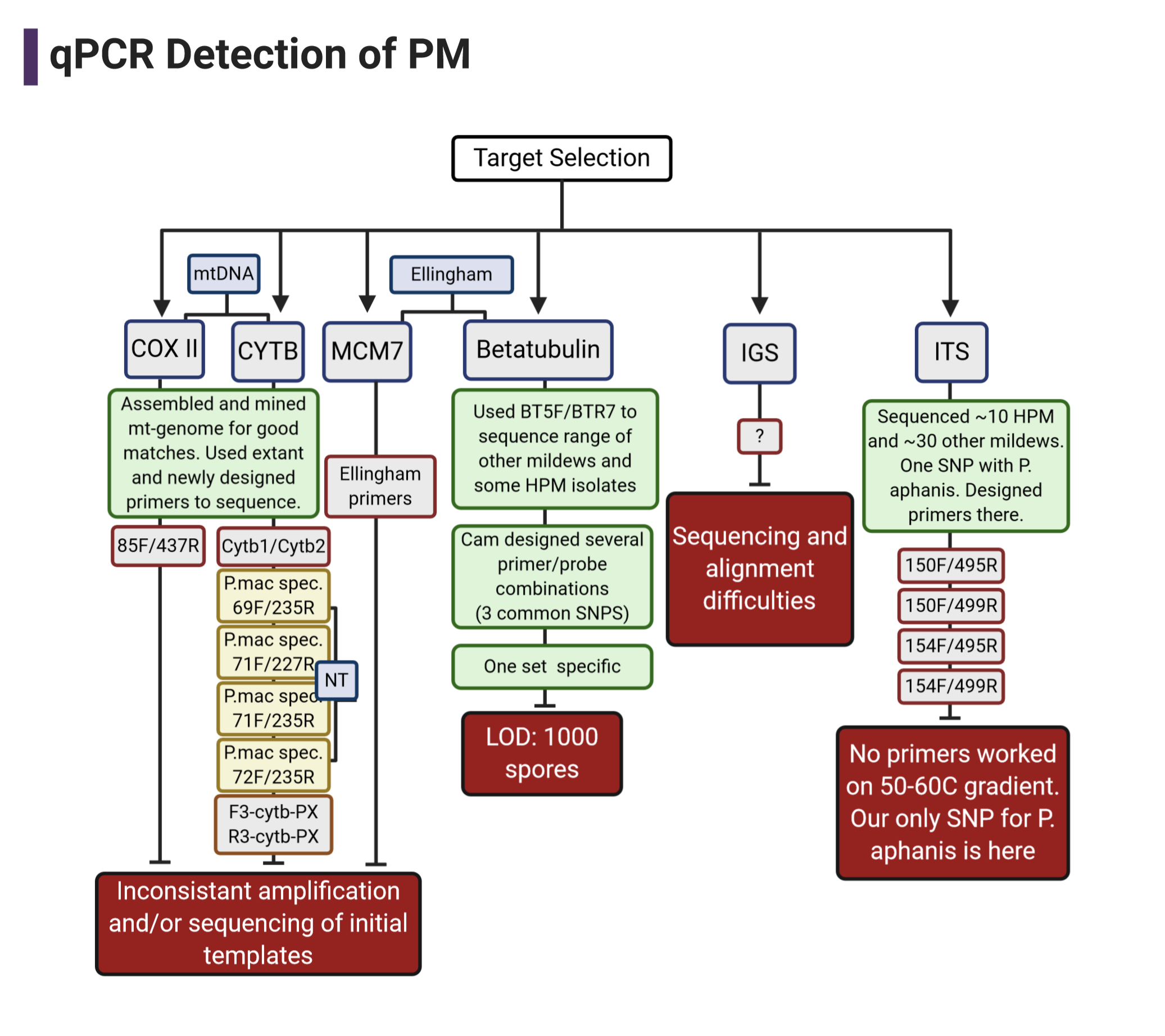
Figure 5. A flow chart I made for a recent presentation using one of their templates
Biorender: The Catch?
If you’re just planning on using Biorender in the classroom, it’s free! Unfortunately, like many good things in life, Biorender comes at a steep cost if you’re planning on publishing the graphics or figures you make using their web-app.
As of February 1st, 2021:
For an individual, Biorender costs between $35-39 a month (:scream: that’s my electricity bill alone!).
For a lab group of five (or less), Biorender costs $99-129/month.
Regardless, if you take into account the cost of hiring a graphic designer or the time you would put-in making comparable publication-quality graphics, I think it’s worth it at the very least on a month-to-month basis. Fortunately, they offer a free trial for you to check it out yourself… if it doesn’t work out for you, just remember to cancel in time…:grimacing:.
Others?
Of course, there are others can can be use alone or in conjuction with powerpoint that also come with their pros and cons:
- Free, open-source
- Steep learning curve for some
- Vector or rastor-based
- Expensive monthly fee
- Easy to use, most popular with designers
- Vector or rastor-based
- Free-ish, but most cool features require payment
- Lots of templates, images, icons available
- Best for simple designs
- Easy to use
Concluding Thoughts?
With the wide-selection of high quality tools available to more-easily make high quality figures, we should not be settling for basic powerpoint figures (unless you’re really good at powerpoint). Regardless of who you choose, check out the different ways you can make your figures pop so we can all collectively do a better job at communicating science.